
Mar 16 · 7 min read
Something that many people don’t think much about viruses is that, like every other organism on Earth struggling for survival, they evolve, or mutate.
Just look at a snippet of the bat virus RNA nucleotide sequence the human virus was derived from…
AAAATCAAAGCTTGTGTTGAAGAAGTTACAACAACTCTGGAAGAAACTAAGTT
…and a snippet from the human COVID-19’s RNA nucleotide sequence…
AAAATTAAGGCTTGCATTGATGAGGTTACCACAACACTGGAAGAAACTAAGTT
…clearly, the coronavirus has changed its internal structure to adapt to the new species of their host (to be more precise, about 20% of the internal structure of the coronavirus was mutated), but maintained enough such that it is still true to its origin species.
In fact, research has shown COVID-19 has mutated repeatedly in ways to boost its survival. In our fight to defeat the coronavirus, we need to find not just how the virus can be destroyed, but how the virus mutates and how those mutations can be addressed.
In this article, I will…
- Provide a surface-level explanation of what RNA nucleotide sequences are
- Use K-Means to create genome information clusters
- Use PCA to visualize the clusters
…and derive insights from each of the analytics procedures we perform.
What are genome sequences?
Feel free to skip over this part if you have a basic understanding of RNA nucleotide sequences.
Genome sequencing, commonly compared to “decoding,” is the process of analyzing deoxyribonucleic acid (DNA) taken from a sample. Within every normal cell are 23 pairs of chromosomes, structures that house DNA.
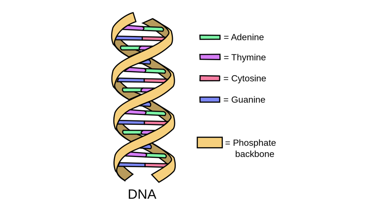
Source. Image free to share and use commercially.
The curled double helix structure of DNA allows it to unwind into a ladder shape. This ladder is made out of paired chemical letters called bases. There are only four of these present in DNA: adenine, thymine, guanine, and cytosine. Adenine joins only with thymine, and guanine joins only with cytosine. These bases are represented with A, T, G, and C, respectively.
These bases form a code of sorts that instructs the organism how to construct proteins — it is the DNA that essentially controls how the virus acts.
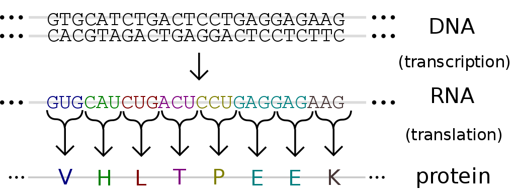
The process of DNA into RNA into protein creation. Source. Image free to share and use commercially.
Using specialized equipment, including sequencing instruments and specialized tags, the DNA sequences of specific fragments are revealed. Information obtained from this undergoes further analysis and comparison to allow researchers to identify changes in genes, associations with diseases and phenotypes, and identify potential drug targets.
The genome sequence, a long string of ‘A’s, ‘T’s, ‘G’s, and ‘C’s, represents how the organism reacts to its environment. Mutations to an organism are created by altering the DNA. Looking at the genome sequence is a strong way to analyze coronavirus mutations.
Get to know the data.
The data, which can be found on Kaggle here, looks like this:
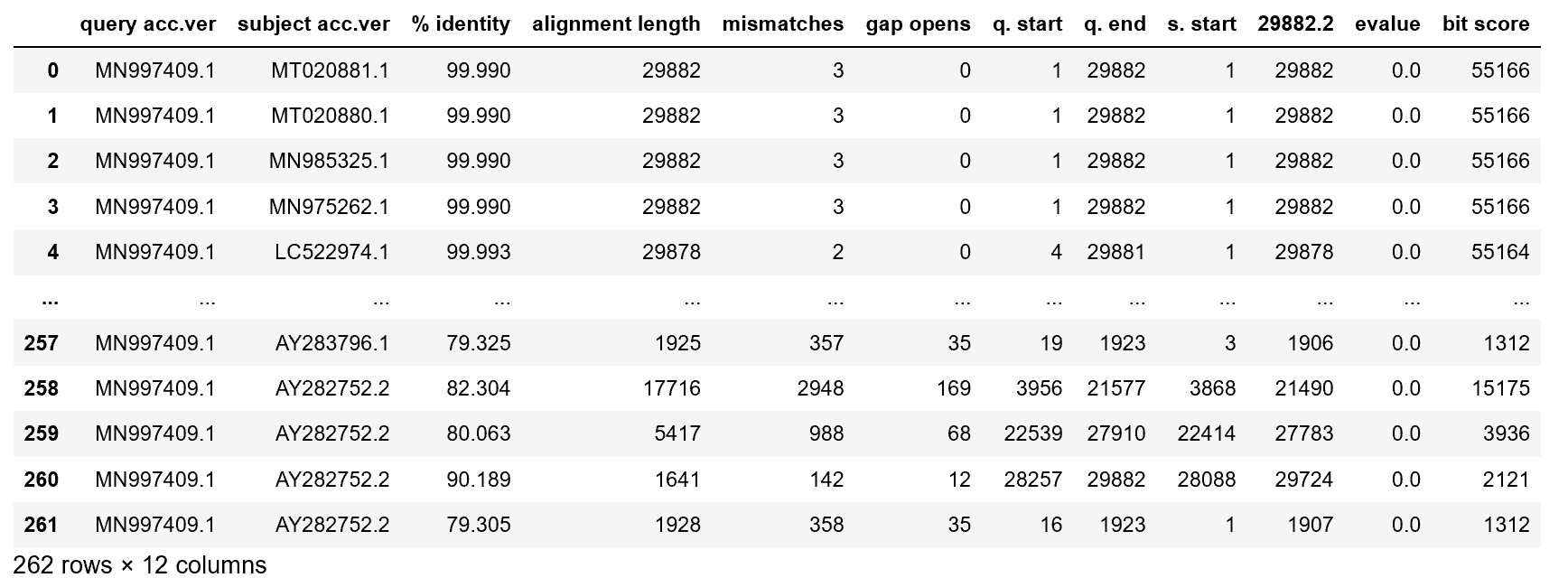
Each one of the rows represents one mutation of the bat virus. First, just take a minute to admire how incredible nature is — within a few weeks, the coronavirus has already created 262 mutations of itself to increase survival rates.
Some important columns:
- query acc.ver represents the original virus identifier.
- subject acc.ver is the identifier for a virus mutation.
- % identity represents what percent of the sequence is the same as the original virus.
- alignment length represents how many items in the sequence are the same, or aligned.
- mismatches represents the number of items that the mutation and the original differ on.
- bit score represents a measure to represent how good an alignment is; the higher the score, the better the alignment.
Some statistical measures of each of the columns (this can be handily called in Python with data.describe()):
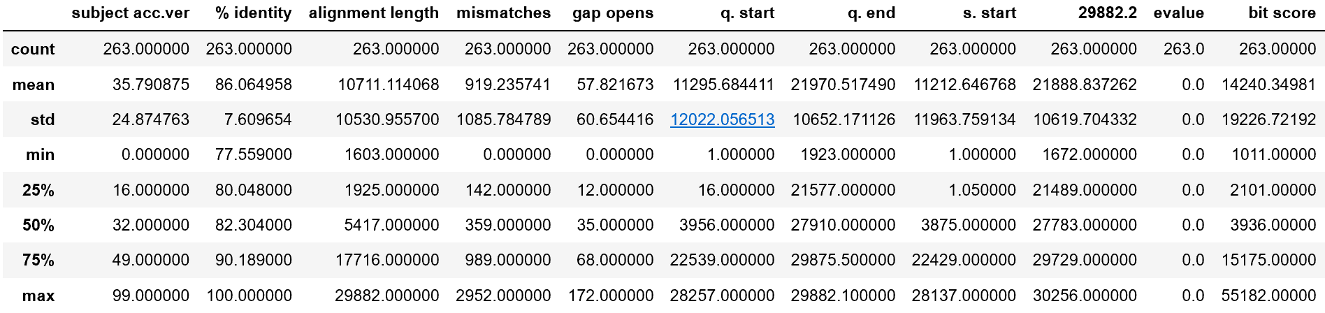
Looking at the % identity column, it is interesting to see the minimum alignment percent a mutation has with the original virus — about 77.6 percent. The rather large standard deviation of 7 percent for % identity means that there is a wide range of mutation. This is supported by a massive standard deviation in bit score — the standard deviation is larger than the mean!
A good way to visualize data is through a correlation heatmap. Each cell represents how correlated one feature is with another.
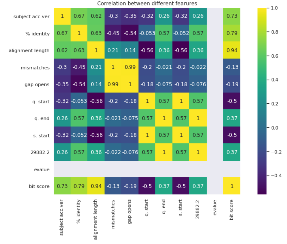
A lot of the data is highly correlated with each other. This makes sense since most of the measures are variations of each other. One thing to take note of if alignment length’s high correlation with bit score.
Using K-Means to Create Mutation Clusters
K-Means is an algorithm for clustering, a method in machine learning to find groups of data points in the feature space. The goal of our K-Means is to find clusters of mutations, so we can derive insights on the nature of the mutations and how to address them.
However, we still need to choose the number of clusters k. While this is as simple as plotting out the points in two dimensions, this is unachievable in higher dimensions (if we want to retain the most information). Methods like the elbow method to choose k are subjective and inaccurate, so instead, we will use the silhouette method.
The silhouette method is a score given to k clusters on how well the clusters suit the data. The sklearn library in Python makes implementing both K-Means and the silouhette method very simple.
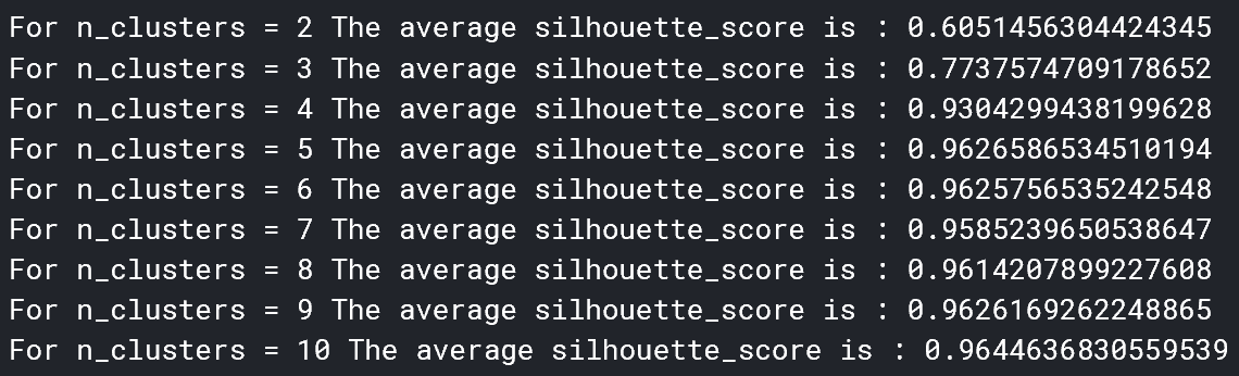
It seems that 5 clusters seems to be the best for the data. Now, we can determine the cluster centers. These are the points in which each cluster is centered around, and represent a numerical evaluation of (in this case) the 5 main types of mutations.
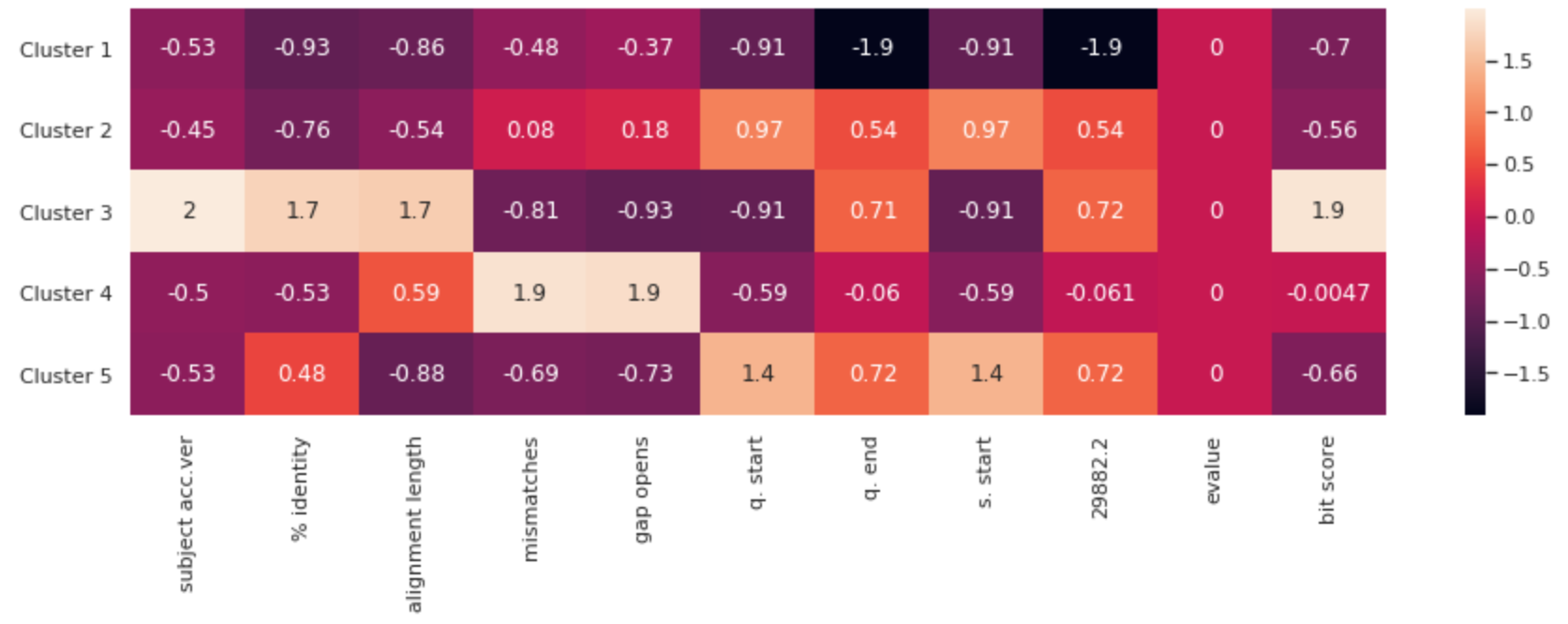
Note: The features have been standardized to put them all on the same scale. Otherwise, columns would not be comparable.
This heatmap represents each cluster’s attributes, by column. Because the points were scaled, the actual annotated values do not quantitatively mean anything. However, scaled values in each column can be compared. You can get a visual sense for the relative attributes of each of the mutation clusters is. If scientists were to develop a vaccine, it should address these main clusters of virii.
In the next section, we will visualize the clusters using PCA.
PCA for Cluster Visualization
PCA, or Principal Component Analysis, is a method of dimensionality reduction. It selects orthogonal vectors in multidimensional space to represent axes, such that the most information (variance) is retained.
With popular Python library sklearn, implementing PCA can be done in two lines. First, we can check the explained variance ratio. This is the percent of statistical information that is retained from the original dataset. The explained variance ratio, in this case, is 0.9838548580740327, which is astronomically high! We can be assured that whatever analyses we take from PCA will be true to the data.
Each new feature (principal component) is a linear combination of several other columns. We can visualize how important a column is to one of the two principal components with a heatmap.
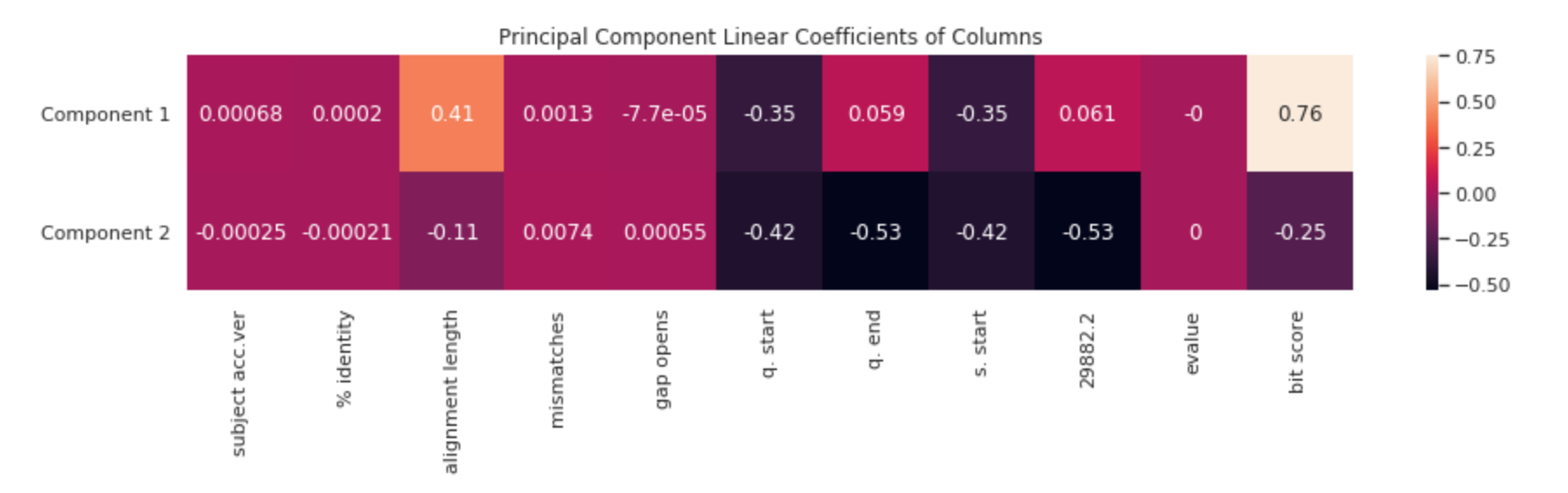
It is important to understand what having a high value in the first component means — in this case, it is characterized by having a higher alignment length (is closer to the original virus), and component 2 is largely characterized by having a shorter alignment length (mutated farther from the original value). This is also reflected by the larger difference in bit score.
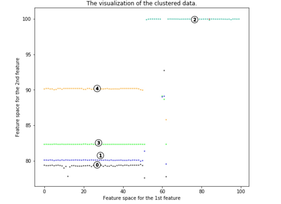
It is clear that there are 5 main strands of the virus mutation. We can take away lots of insights.
Four of the virus mutations are on the left side of the first principal component, and one on the right side. A signature of the first principal component is a high alignment length. This means that a higher value for a first principal component means a higher alignment length (is closer to the original virus). Lower values of component 1, thus, are farther genetically from the original virus. Most of the virus clusters vary largely from the original virus. Hence, scientists attempting to create a vaccine should be aware that the virus mutates a lot.
Conclusion
Using K-Means and PCA, were able to identify five main clusters of mutations in the coronavirus. Scientists developing vaccines for the coronavirus can use the cluster centers to gain knowledge about characteristics of each cluster. We were able to visualize the clusters in two dimensions using principal component analysis, and found that the coronavirus has a very high rate of mutation. This may be what makes it so deadly.
Thanks for reading!
If you enjoyed, feel free to check out some of my other work, like this one on taking data into your own hands and unveiling insights on the coronavirus using simple analytics.
Note from the editors: Towards Data Science is a Medium publication primarily based on the study of data science and machine learning. We are not health professionals or epidemiologists, and the opinions of this article should not be interpreted as professional advice. To learn more about the coronavirus pandemic, you can click here.
'Bioinformatics' 카테고리의 다른 글
| "구충제 이버멕틴, 코로나19 바이러스 48시간 내 죽인다" (0) | 2020.04.06 |
|---|---|
| COVID-19: consider cytokine storm syndromes and immunosuppression (0) | 2020.03.21 |
| "코로나19 더워도 확산" 말레이시아·인도네시아 감염자 늘어 (0) | 2020.03.19 |
| [2020-03-09] 코로나19 확진 96명 증가, 총 7천478명…사망 53명·완치 166명 (0) | 2020.03.10 |
| [2020-03-07] Unknown Period Century Pollution Area (0) | 2020.03.07 |