728x90

예를 들어 h2를 p로 바꾸고 싶다면 다음과 같이 합니다.


1

$( 'h2' ).contents().unwrap().wrap( '<p></p>' );

  1. h2 요소를 선택하고
  2. 내용으로 들어간 후
  3. h2 태그를 없애고
  4. p 태그로 감싼다.

새로운 태그를 붙이면서 클래스를 넣을 수도 있습니다.


1

$( 'h2' ).contents().unwrap().wrap( '<p class="myclass"></p>' );

728x90

A post revision or two won’t take up a ton of space.

But they do start to add up after a while and take up a considerable amount of space on your database.

Whether you’re in a pursuit to free up some much needed space or prevent the matter altogether, removing old post revisions from your WordPress site is an available option, and in this article I’ll show you how to do just that.

Disabling/Re-enabling Post Revisions

In order to disable post revisions permanently, locate your WordPress site’s wp-config.php file that’s located in the root directory. Add the following line of code at the very top:

define( ‘WP_POST_REVISIONS’, false );

This line of code disables post revisions from being saved to your database in the future. If you’d like to enable this option sometime in the future (for whatever reason), simply replace the line with:

define( ‘WP_POST_REVISIONS’, true );

Limiting Post Revisions

If you’re anything like me, you’ll want to save a couple of post revisions for every post you add to your site – just to be on the safe side. For this, the best option is to set a limit on the number of post revisions that are saved to your database. Add the following line to your wp-config.phpfile:

define( ‘WP_POST_REVISIONS’, 3 );

What this line does is that it saves the 3 most recent post revisions instead of all of them i.e. the older ones are automatically deleted once newer versions are saved. You can replace the number 3 with another integer depending on your preference.

Setting the Auto-Save Interval

Instead of limiting the post revisions to a pre-defined number you can also increase the auto-save interval to save fewer revisions. To do this, open up your site’s wp-config.php file and add the following line at the top:

define( ‘AUTOSAVE_INTERVAL’, 600 );

By default, WordPress auto-saves your post revisions every minute (60 seconds) but by adding this line it’ll save them every ten minutes (600 seconds). This automatically reduces the number of post revisions that are stored to the database.

If you shy away from coding or adding code to your site’s wp-config.php file, you can always get the job done by installing a plugin. Some popular choices are WP-Sweep and WP Revisions Control.

It’s important that you understand that the techniques we covered disable post revisions from being saved for future posts. What about the past revisions?

How to Remove Old Post Revisions

In this section we’ll cover two methods of permanently removing old post revisions from your WordPress site’s database.

Those of you who are familiar (and comfortable) with SQL queries can go with the first method. But if you’d prefer using a plugin then go ahead and skip right down to the second method.

Method 1: Deleting Post Revisions Using Code

Deleting post revisions from your database is one of those things that you should be able to do without having to install a plugin (although there are plugins for it too which we’ll cover next). I mean, you’re trying to save space and installing a plugin goes against that.

In order to delete all of your past post revisions from your site’s database, go to your site’s PHPMyAdmin and execute the following SQL query:

DELETE from wp_posts WHERE post_type = “revision”;

This SQL query removes all posts from your database that have post_type = “revision”. Some webmasters might want to create a backup of their database prior to running this query as an added security measure. In my personal opinion, it’s always best to make backups of your database before you make drastic changes to it.

Method 2: Deleting Post Revisions Using A Plugin

Although deleting post revisions from your WordPress site can be accomplished by running a single SQL query, some webmasters will find it easier to install a plugin and let it do all the work. This might be because the plugin has added benefits (database maintenance, removes excess files etc.) or simply because they’re not comfortable with programming.

Revision Control

Revision Control enables users to gain finer control over their WordPress site’s post revision system. With its simple one-click functionality, users can choose to disable or enable post revisions without have to get into the nitty gritty code.

The plugin also enables users to set limits on the number of post revisions that are saved to the database. Revision Control’s fine-tuned system lets webmaster disable, enable and set restrictions for either posts or pages depending upon their preference.

Better Delete Revision

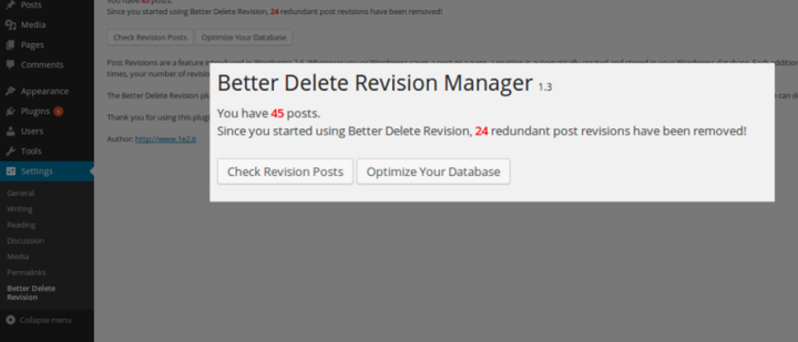
The Better Delete Revision plugin removes redundant post revisions from your WordPress site’s database in addition to the meta-data that is associated with them including tags and relationships. The plugin is careful not to mess with your site’s published content or posts that have been scheduled to be posted.

Most webmasters, even those that are familiar with WordPress programming, often choose to remove post revisions using this plugin because it also performs some light database optimization.

Both of these plugins are available for free.

Wrapping It Up

Post revisions don’t slow your site down or pose as an issue for user experience. They do, however, start to take up a lot of space on your site’s database after a while.

If you’ve been publishing posts on your WordPress site for a few years now then removing the old post revisions will clear up a significant amount of space for you on your database.

On the other hand, if you’re just starting out as a WordPress blogger, then you can leverage the first part of this tutorial and disable old post revisions.

We hope you our tutorial helped you learn how to Disable and Remove Old Post Revisions in WordPress. You may also want to see our post on 5 things you need to do to keep your WordPress site running Smoothly.

Which method are you most comfortable with for disabling/removing old post revisions? Is there another method you use? Let us know in the comments section below!

'WEB > WP(WordPress)' 카테고리의 다른 글

Theme and Plugins Localization  (0) 2019.08.09
Divi Theme & mangboard colision  (0) 2019.07.06
DIVI TUTORIAL – CENTER ALIGN MULTIPLE BUTTONS  (0) 2019.05.23
How to Vertically Align Content in Divi  (0) 2019.05.23
get_bloginfo  (0) 2019.05.22
728x90

I wanted to embed a YouTube <iframe> in a webpage. I wanted it to be full-width (that is, width: 100%), but keep the normal YouTube aspect ratio. I wanted it to behave like an <img>, where the image file contains its fixed aspect ratio, which the browser uses to lay out the image appropriately.

Unlike <img>s, <iframe>s don’t have a fixed aspect ratio, because <iframe>s embed web pages, which don’t have fixed/known aspect ratios. But for the particular case of YouTube videos, there is a fixed aspect ratio we want: the standard <iframe> has width="560" height="315", which simplifies to a 16:9 aspect ratio. Can we tell the browser to display an <iframe> at width: 100%; aspect-ratio: 16:9;?

There is no aspect-ratio property, but we can do this with CSS. The 16:9 aspect ratio corresponds to a height which is 56.25% of the width. To make a CSS box which is 56.25% of its own width, we can use the padding-top property with a percentage, which is proportional to its own width.


Like this:

<div style="padding-top: 56.25%;background-color: yellow;"></div>

Next, we put the <iframe> inside this box, making it fill the whole box. To size the <iframe>, we ignore the width="560" height="315" element properties, and instead use the CSS properties width:100%;height:100%;.

<div style="padding-top:56.25%;background-color: yellow;"> <iframe src="https://www.youtube.com/embed/nckseQJ1Nlg" frameborder="0" allowfullscreen style="width:100%;height:100%;"></iframe>

</div>


Oh no, that’s not right at all! The <iframe> is not the right height, and it’s not positioned correctly. We can fix these with the position attribute:

<div style="position:relative;padding-top:56.25%;"> <iframe src="https://www.youtube.com/embed/nckseQJ1Nlg" frameborder="0" allowfullscreen style="position:absolute;top:0;left:0;width:100%;height:100%;"></iframe> </div>


That’s it: a full-width <iframe> with fixed aspect ratio. Enjoy.

Get updates on Twitter


트위터의 James Fisher (@MrJamesFisher) 님


twitter.com

하지만 여기서 가장 중요한 것은 position을 absolute 속성으로 지정하는 경우, 다른 element 의 위치를 침범해버린다. 따라서 다음과 같이 수정한다.


<iframe src="https://www.youtube.com/embed/nckseQJ1Nlg" frameborder="0" allowfullscreen style="top : 0px; left:0px; width : 100%; height : 100%;"></iframe>
728x90

Posted by PK | Jan 16, 2018 | CSS, Divi, Tips & Tricks, Tutorials | 27  |     

This one is a really useful tip that I think you’re gonna like.

Aligning buttons. Woot!

Note: This can apply to lots and lots of other cases, I might make more tutorials on flexbox, because I love it so much, but that’ll come later. After I finish this one.

Edit
If you want to learn flexbox and how to build using Divi with awesome responsiveness in mind, check out this course I made.

So, here’s where we start.

Let’s add three buttons. All in one column.

It looks pretty great at this moment.

Just like a test site should.

Now, to flex these bad boys.

First, let’s add a class to the section so we can use this in other places later.

Now to code the alignments.

Note: The final code will be at the end of this post, so you don’t have to copy paste every line separately. Just read along for now.

First, the way flexbox works is by changing the display type. But we need to make it filter down through the row and into the column where it’s needed.

1 .flexing-away .et_pb_row .et_pb_column {
2     display: flex;
3 }

This gives us:

As you can see, the previous stacked layout is now on one line.

What flexbox does is it scrunches up all the elements inside its display area, and puts them all next to each other.
So we’ll need to align them. Let’s align them to the center both vertically and horizontally.

justify-content is used for horizontal alignment, and align-items is for vertical.

1 .flexing-away .et_pb_row .et_pb_column {
2     display: flex;
3     justify-content: center;
4     align-items: center;
5 }

This gives us:

Yay! Progress!
So what we need to do now is to give the buttons some space between them.

There are a couple of ways of doing this..
1. Give the middle button margins to the left and right.
2. Give all the buttons half margins to the left and right.

It’s up to you on how to add the margins as well. You can do it through the Divi builder settings, separate css in the button’s custom css settings, add an nth item selector to the column, or just do it in what I think is the easiest way: just target all the buttons and give them some margins. Like this:

1 .flexing-away .et_pb_row .et_pb_column .et_pb_module {
2     margin-left: .2rem;
3     margin-right: .2rem;
4 }

The reason why I wrote the css as above is because
a. it’ll target the modules inside the sections you assigned with .flexing-away, and not any other modules
b. it’ll also target other modules if in such section, which you might need, and
c. I use rem units, but you can change it to ems, or px, it’s up to you. I personally like rem.

So here we have it!

Pretty nifty, eh?

But what about MOBILE????

Ah, yes. We can’t leave out mobile.

So we need to do two things:
1. make the buttons stack
2. make them 100% width with the text inside centered.

here’s the css for that

1 @media all and (max-width: 479px) {
2     .flexing-away .et_pb_row .et_pb_column {
3         flex-wrap: wrap;
4     }
5     .flexing-away .et_pb_row .et_pb_column .et_pb_module {
6         width: 100%;
7         text-align: center;
8     }
9 }

Of course, you can try resizing the browser, and see what you like and change the max-width pixel width to assign when the buttons are gonna stack.

and there you have it.

Note: all the css should be added in Divi > theme options > custom css for this new super power to be applied across the whole website.

Here’s the final code snippet. I added comments for you to easily modify.

1 .flexing-away .et_pb_row .et_pb_column {
2     display: flex; /* add flexbox */
3     justify-content: center; /* keep items centered horizontally */
4     align-items: center; /* keep items centered vertically */
5 }
6 .flexing-away .et_pb_row .et_pb_column .et_pb_module {
7     margin-left: .2rem; /* change to whatever pixels you want */
8     margin-right: .2rem; /* it's good to have the same margin on either side */
9 }
10 @media all and (max-width: 479px) {
11     .flexing-away .et_pb_row .et_pb_column {
12         flex-wrap: wrap; /* let the items start switching lines */
13     }
14     .flexing-away .et_pb_row .et_pb_column .et_pb_module {
15         width: 100%; /* no more space left after 100%, so the buttons will break lines */
16         text-align: center; /* leave this line in if you want the text inside the button to be centered */
17     }
18 }

NOTICE

Hi! Please consider signing up for my newsletter for... two emails (at most) a month of news, updates, and special offers, including child themes and more courses. Sound interesting? The signup form is right here!

'WEB > WP(WordPress)' 카테고리의 다른 글

Divi Theme & mangboard colision  (0) 2019.07.06
How To Disable And Remove Old Post Revisions In WordPress  (0) 2019.05.28
How to Vertically Align Content in Divi  (0) 2019.05.23
get_bloginfo  (0) 2019.05.22
The Divi Button Module  (0) 2019.05.22

+ Recent posts