Posted by PK | Jan 16, 2018 | CSS, Divi, Tips & Tricks, Tutorials | 27 |
This one is a really useful tip that I think you’re gonna like.
Aligning buttons. Woot!
Note: This can apply to lots and lots of other cases, I might make more tutorials on flexbox, because I love it so much, but that’ll come later. After I finish this one.
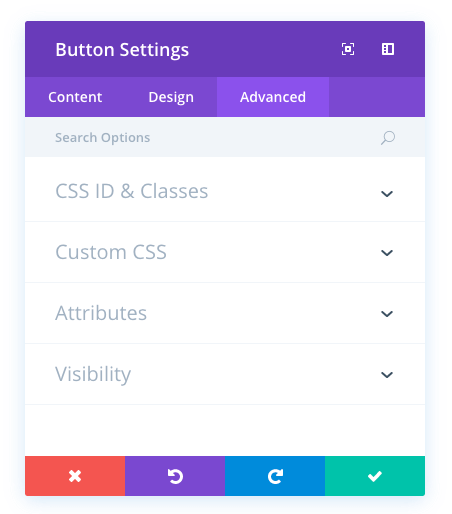
Edit
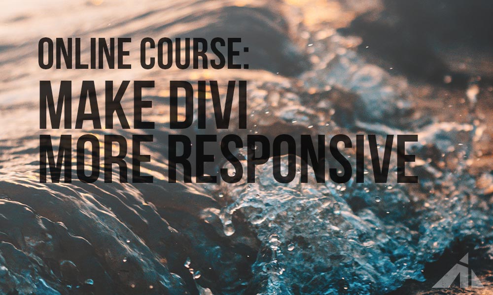
If you want to learn flexbox and how to build using Divi with awesome responsiveness in mind, check out this course I made.
So, here’s where we start.
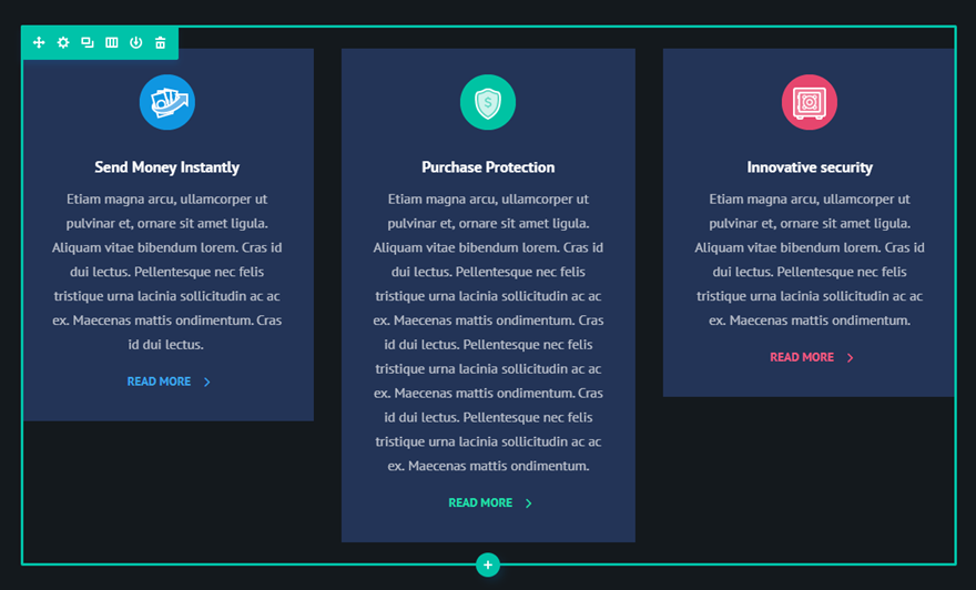
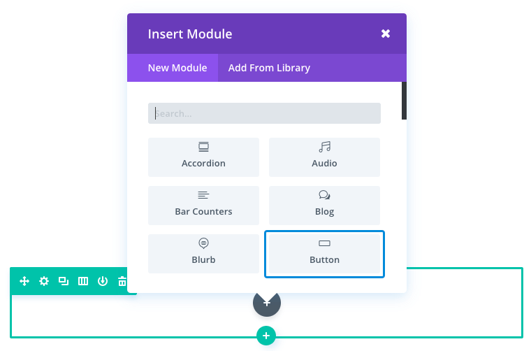
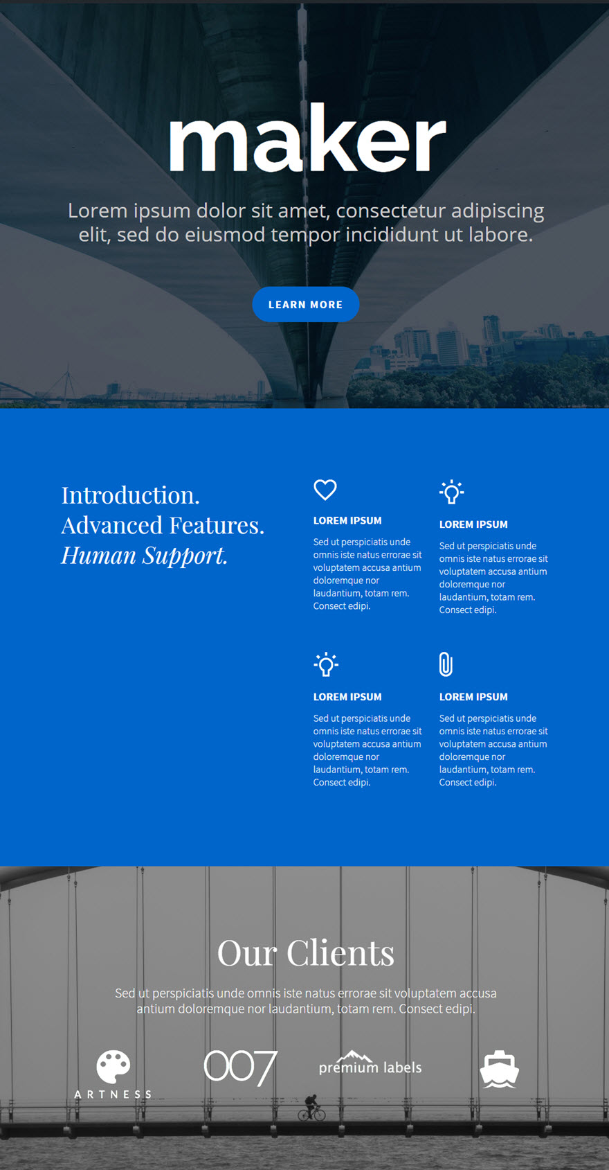
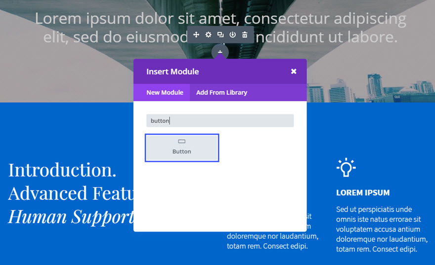
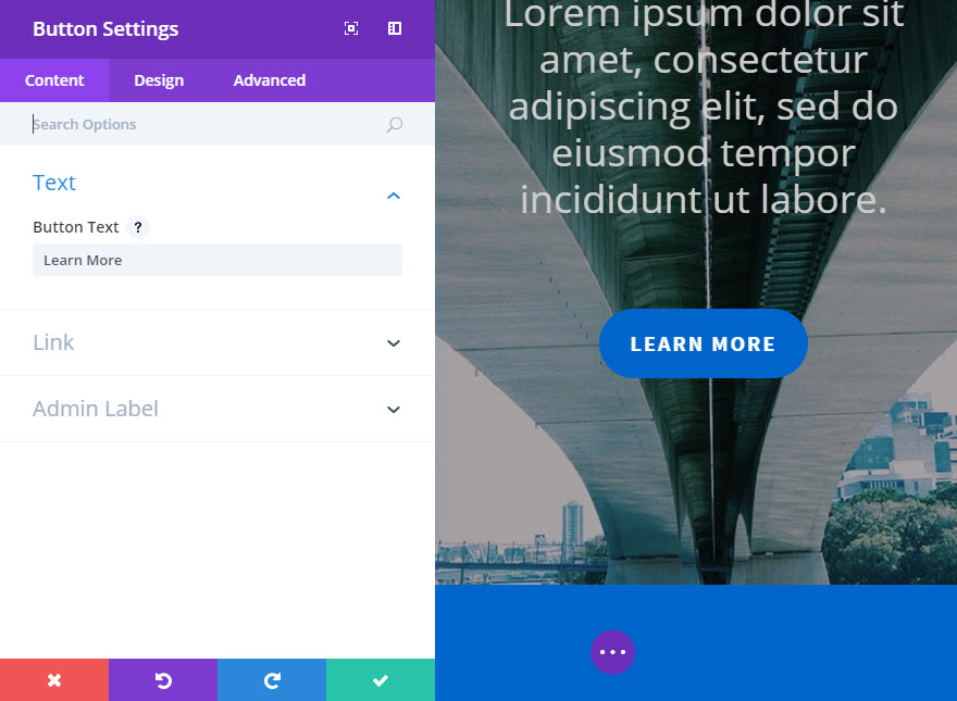
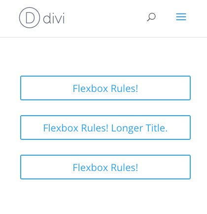
Let’s add three buttons. All in one column.
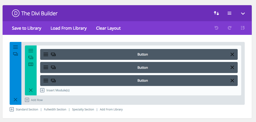
It looks pretty great at this moment.
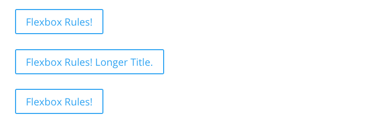
Just like a test site should.
Now, to flex these bad boys.
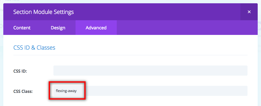
First, let’s add a class to the section so we can use this in other places later.
Now to code the alignments.
Note: The final code will be at the end of this post, so you don’t have to copy paste every line separately. Just read along for now.
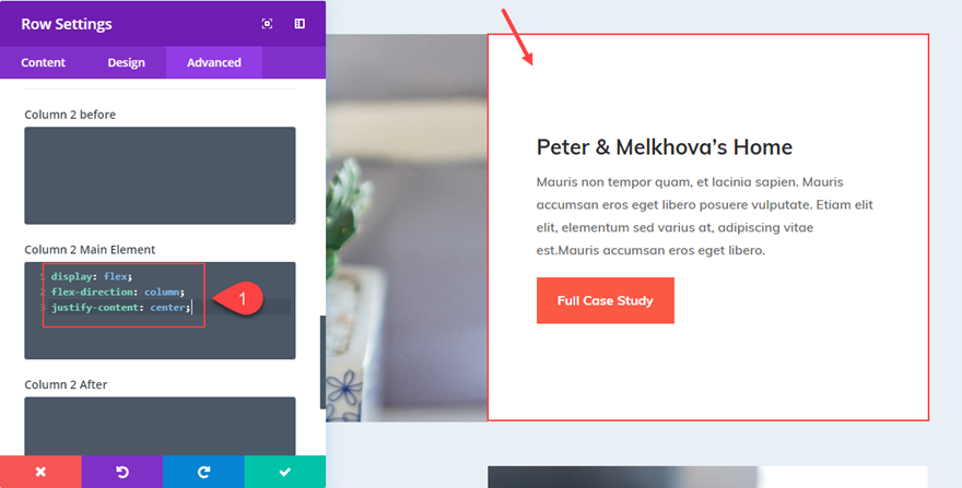
First, the way flexbox works is by changing the display type. But we need to make it filter down through the row and into the column where it’s needed.
| 1 | .flexing-away .et_pb_row .et_pb_column { |
| 2 | display: flex; |
| 3 | } |
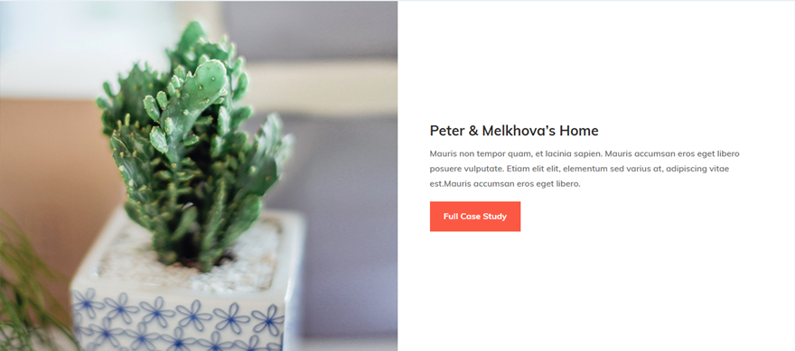
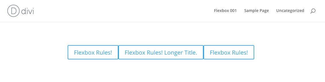
This gives us:

As you can see, the previous stacked layout is now on one line.
What flexbox does is it scrunches up all the elements inside its display area, and puts them all next to each other.
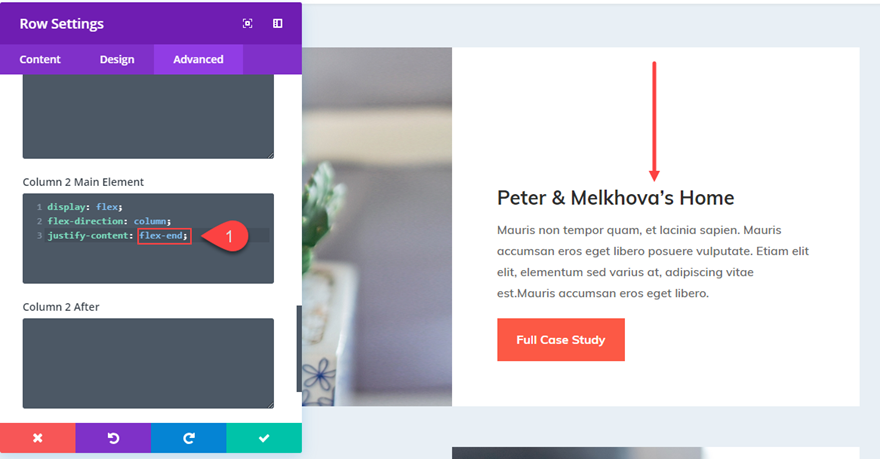
So we’ll need to align them. Let’s align them to the center both vertically and horizontally.
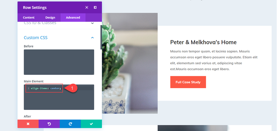
justify-content is used for horizontal alignment, and align-items is for vertical.
| 1 | .flexing-away .et_pb_row .et_pb_column { |
| 2 | display: flex; |
| 3 | justify-content: center; |
| 4 | align-items: center; |
| 5 | } |
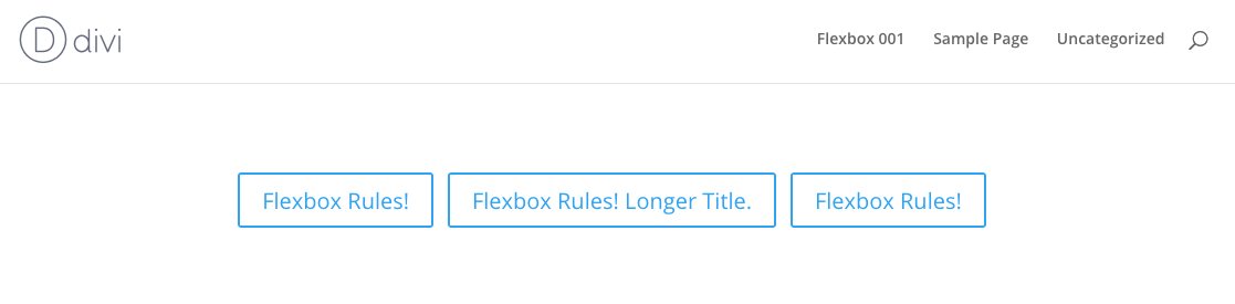
This gives us:
Yay! Progress!
So what we need to do now is to give the buttons some space between them.
There are a couple of ways of doing this..
1. Give the middle button margins to the left and right.
2. Give all the buttons half margins to the left and right.
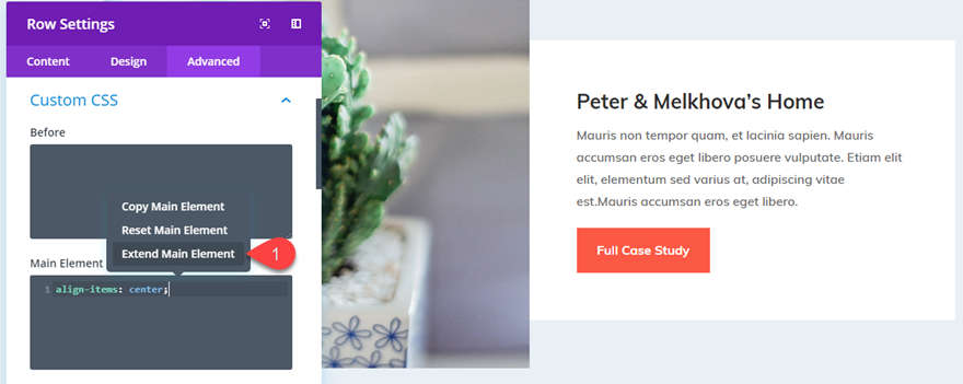
It’s up to you on how to add the margins as well. You can do it through the Divi builder settings, separate css in the button’s custom css settings, add an nth item selector to the column, or just do it in what I think is the easiest way: just target all the buttons and give them some margins. Like this:
| 1 | .flexing-away .et_pb_row .et_pb_column .et_pb_module { |
| 2 | margin-left: .2rem; |
| 3 | margin-right: .2rem; |
| 4 | } |
The reason why I wrote the css as above is because
a. it’ll target the modules inside the sections you assigned with .flexing-away, and not any other modules
b. it’ll also target other modules if in such section, which you might need, and
c. I use rem units, but you can change it to ems, or px, it’s up to you. I personally like rem.
So here we have it!
Pretty nifty, eh?
But what about MOBILE????
Ah, yes. We can’t leave out mobile.
So we need to do two things:
1. make the buttons stack
2. make them 100% width with the text inside centered.
here’s the css for that
| 1 | @media all and (max-width: 479px) { |
| 2 | .flexing-away .et_pb_row .et_pb_column { |
| 3 | flex-wrap: wrap; |
| 4 | } |
| 5 | .flexing-away .et_pb_row .et_pb_column .et_pb_module { |
| 6 | width: 100%; |
| 7 | text-align: center; |
| 8 | } |
| 9 | } |
Of course, you can try resizing the browser, and see what you like and change the max-width pixel width to assign when the buttons are gonna stack.
and there you have it.
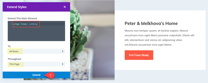
Note: all the css should be added in Divi > theme options > custom css for this new super power to be applied across the whole website.
Here’s the final code snippet. I added comments for you to easily modify.
| 1 | .flexing-away .et_pb_row .et_pb_column { |
| 2 | display: flex; /* add flexbox */ |
| 3 | justify-content: center; /* keep items centered horizontally */ |
| 4 | align-items: center; /* keep items centered vertically */ |
| 5 | } |
| 6 | .flexing-away .et_pb_row .et_pb_column .et_pb_module { |
| 7 | margin-left: .2rem; /* change to whatever pixels you want */ |
| 8 | margin-right: .2rem; /* it's good to have the same margin on either side */ |
| 9 | } |
| 10 | @media all and (max-width: 479px) { |
| 11 | .flexing-away .et_pb_row .et_pb_column { |
| 12 | flex-wrap: wrap; /* let the items start switching lines */ |
| 13 | } |
| 14 | .flexing-away .et_pb_row .et_pb_column .et_pb_module { |
| 15 | width: 100%; /* no more space left after 100%, so the buttons will break lines */ |
| 16 | text-align: center; /* leave this line in if you want the text inside the button to be centered */ |
| 17 | } |
| 18 | } |
NOTICE
Hi! Please consider signing up for my newsletter for... two emails (at most) a month of news, updates, and special offers, including child themes and more courses. Sound interesting? The signup form is right here!
'WEB > WP(WordPress)' 카테고리의 다른 글
| Divi Theme & mangboard colision (0) | 2019.07.06 |
|---|---|
| How To Disable And Remove Old Post Revisions In WordPress (0) | 2019.05.28 |
| How to Vertically Align Content in Divi (0) | 2019.05.23 |
| get_bloginfo (0) | 2019.05.22 |
| The Divi Button Module (0) | 2019.05.22 |