A post revision or two won’t take up a ton of space.
But they do start to add up after a while and take up a considerable amount of space on your database.
Whether you’re in a pursuit to free up some much needed space or prevent the matter altogether, removing old post revisions from your WordPress site is an available option, and in this article I’ll show you how to do just that.
Disabling/Re-enabling Post Revisions
In order to disable post revisions permanently, locate your WordPress site’swp-config.phpfile that’s located in the root directory. Add the following line of code at the very top:
define( ‘WP_POST_REVISIONS’, false );
This line of code disables post revisions from being saved to your database in the future. If you’d like to enable this option sometime in the future (for whatever reason), simply replace the line with:
define( ‘WP_POST_REVISIONS’, true );
Limiting Post Revisions
If you’re anything like me, you’ll want to save a couple of post revisions for every post you add to your site – just to be on the safe side. For this, the best option is to set a limit on the number of post revisions that are saved to your database. Add the following line to yourwp-config.phpfile:
define( ‘WP_POST_REVISIONS’, 3 );
What this line does is that it saves the 3 most recent post revisions instead of all of them i.e. the older ones are automatically deleted once newer versions are saved. You can replace the number3with another integer depending on your preference.
Setting the Auto-Save Interval
Instead of limiting the post revisions to a pre-defined number you can also increase the auto-save interval to save fewer revisions. To do this, open up your site’s wp-config.phpfile and add the following line at the top:
define( ‘AUTOSAVE_INTERVAL’, 600 );
By default, WordPress auto-saves your post revisions every minute (60 seconds) but by adding this line it’ll save them every ten minutes (600 seconds). This automatically reduces the number of post revisions that are stored to the database.
If you shy away from coding or adding code to your site’s wp-config.phpfile, you can always get the job done by installing a plugin. Some popular choices areWP-SweepandWP Revisions Control.
It’s important that you understand that the techniques we covered disable post revisions from being saved forfutureposts. What about the past revisions?
How to Remove Old Post Revisions
In this section we’ll cover two methods of permanently removing old post revisions from your WordPress site’s database.
Those of you who are familiar (and comfortable) with SQL queries can go with the first method. But if you’d prefer using a plugin then go ahead and skip right down to the second method.
Method 1: Deleting Post Revisions Using Code
Deleting post revisions from your database is one of those things that you should be able to do without having to install a plugin (although there are plugins for it too which we’ll cover next). I mean, you’re trying to save space and installing a plugin goes against that.
In order to delete all of your past post revisions from your site’s database, go to your site’s PHPMyAdmin and execute the following SQL query:
DELETE from wp_posts WHERE post_type = “revision”;
This SQL query removes all posts from your database that havepost_type = “revision”. Some webmasters might want to create a backup of their database prior to running this query as an added security measure. In my personal opinion, it’s always best to make backups of your database before you make drastic changes to it.
Method 2: Deleting Post Revisions Using A Plugin
Although deleting post revisions from your WordPress site can be accomplished by running a single SQL query, some webmasters will find it easier toinstall a pluginand let it do all the work. This might be because the plugin has added benefits (database maintenance, removes excess files etc.) or simply because they’re not comfortable with programming.
Revision Control enables users to gain finer control over their WordPress site’s post revision system. With its simple one-click functionality, users can choose to disable or enable post revisions without have to get into the nitty gritty code.
The plugin also enables users to set limits on the number of post revisions that are saved to the database. Revision Control’s fine-tuned system lets webmaster disable, enable and set restrictions for either posts or pages depending upon their preference.
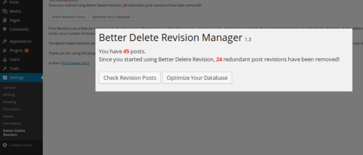
The Better Delete Revision plugin removes redundant post revisions from your WordPress site’s database in addition to the meta-data that is associated with them including tags and relationships. The plugin is careful not to mess with your site’s published content or posts that have been scheduled to be posted.
Most webmasters, even those that are familiar with WordPress programming, often choose to remove post revisions using this plugin because it also performs some light database optimization.
Both of these plugins are available for free.
Wrapping It Up
Post revisions don’t slow your site down or pose as an issue for user experience. They do, however, start to take up a lot of space on your site’s database after a while.
If you’ve been publishing posts on your WordPress site for a few years now then removing the old post revisions will clear up a significant amount of space for you on your database.
On the other hand, if you’re juststarting out as a WordPress blogger, then you can leverage the first part of this tutorial and disable old post revisions.
We hope you our tutorial helped you learn how to Disable and Remove Old Post Revisions in WordPress. You may also want to see our post on 5 things you need to do tokeep your WordPress site running Smoothly.
Which method are you most comfortable with for disabling/removing old post revisions? Is there another method you use? Let us know in the comments section below!
This one is a really useful tip that I think you’re gonna like.
Aligning buttons. Woot!
Note: This can apply to lots and lots of other cases, I might make more tutorials on flexbox, because I love it so much, but that’ll come later. After I finish this one.
Edit If you want to learn flexbox and how to build using Divi with awesome responsiveness in mind, check out this course I made.
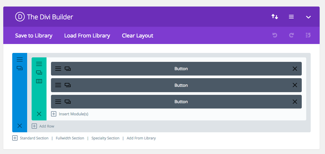
So, here’s where we start.
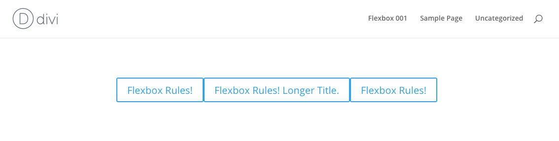
Let’s add three buttons. All in one column.
It looks pretty great at this moment.
Just like a test site should.
Now, to flex these bad boys.
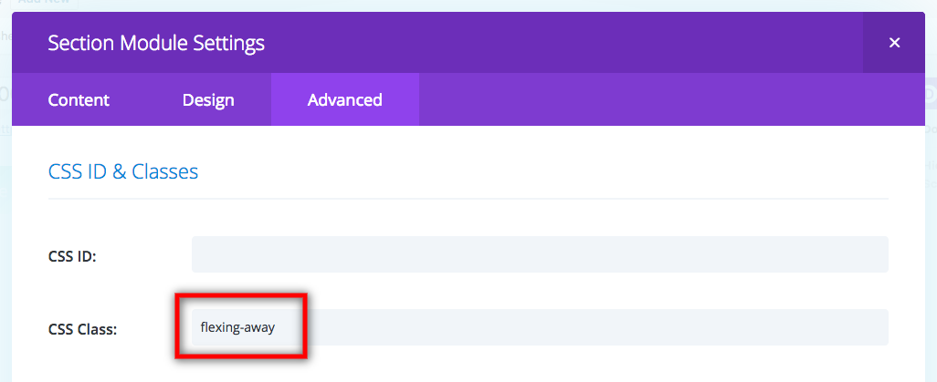
First, let’s add a class to the section so we can use this in other places later.
Now to code the alignments.
Note: The final code will be at the end of this post, so you don’t have to copy paste every line separately. Just read along for now.
First, the way flexbox works is by changing the display type. But we need to make it filter down through the row and into the column where it’s needed.
1
.flexing-away .et_pb_row .et_pb_column {
2
display: flex;
3
}
This gives us:
As you can see, the previous stacked layout is now on one line.
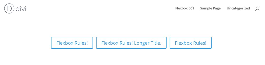
What flexbox does is it scrunches up all the elements inside its display area, and puts them all next to each other. So we’ll need to align them. Let’s align them to the center both vertically and horizontally.
justify-content is used for horizontal alignment, and align-items is for vertical.
1
.flexing-away .et_pb_row .et_pb_column {
2
display: flex;
3
justify-content:center;
4
align-items:center;
5
}
This gives us:
Yay! Progress! So what we need to do now is to give the buttons some space between them.
There are a couple of ways of doing this.. 1. Give the middle button margins to the left and right. 2. Give all the buttons half margins to the left and right.
It’s up to you on how to add the margins as well. You can do it through the Divi builder settings, separate css in the button’s custom css settings, add an nth item selector to the column, or just do it in what I think is the easiest way: just target all the buttons and give them some margins. Like this:
The reason why I wrote the css as above is because a. it’ll target the modules inside the sections you assigned with .flexing-away, and not any other modules b. it’ll also target other modules if in such section, which you might need, and c. I use rem units, but you can change it to ems, or px, it’s up to you. I personally like rem.
So here we have it!
Pretty nifty, eh?
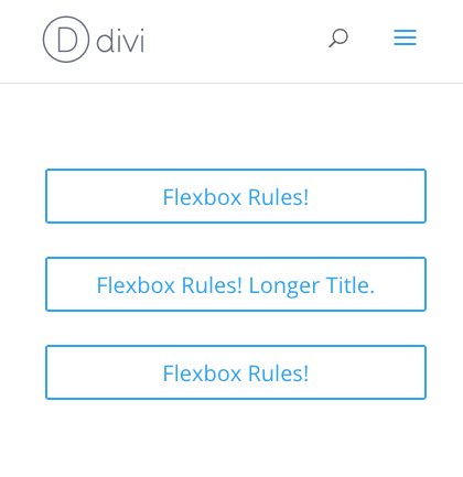
But what about MOBILE????
Ah, yes. We can’t leave out mobile.
So we need to do two things: 1. make the buttons stack 2. make them 100% width with the text inside centered.
width:100%;/* no more space left after 100%, so the buttons will break lines */
16
text-align:center;/* leave this line in if you want the text inside the button to be centered */
17
}
18
}
NOTICE
Hi! Please consider signing up for my newsletter for... two emails (at most) a month of news, updates, and special offers, including child themes and more courses. Sound interesting? The signup form is right here!
The ability to vertically align content when building a site with Divi can be a convenient addition to your design tool belt. Sometimes a certain layout calls for content to be vertically aligned in different ways (centered, bottom, top). The most common need is to have your content vertically centered. It provides a delightful touch of symmetrical spacing that really comes in handy when using multiple column layouts for your content. Plus, vertically centered content stays centered on different browser widths, which takes the grunt work out of applying custom padding or margins to get similar responsiveness.
In this tutorial, I’m going to show you how you can add a few small snippets of CSS to any column to vertically align the content. I’ll be using some of Divi’s premade layouts for examples of how to do this. If you don’t know much about CSS, you don’t have to worry. This will be easy enough to apply to your own layouts in seconds.
Understanding Flex and Divi
The Flex (or Flexbox) css property is simply a way for positioning elements in horizontal and/or vertical stacks (kind of like a table). Except, unlike traditional tables, the flex property allows you to create boxes that adjust or “flex” to the size of the content it holds.
Divi does use the flex property whenever you select “Equalize Column Heights” as your row setting. This simply makes sure the size of your columns will all adjust to the size of the column with the most content. And since “Equalize Column Heights” activates the flex for the row container, you can easily take advantage of that by adding css to your columns to adjust the contents of each column (or box).
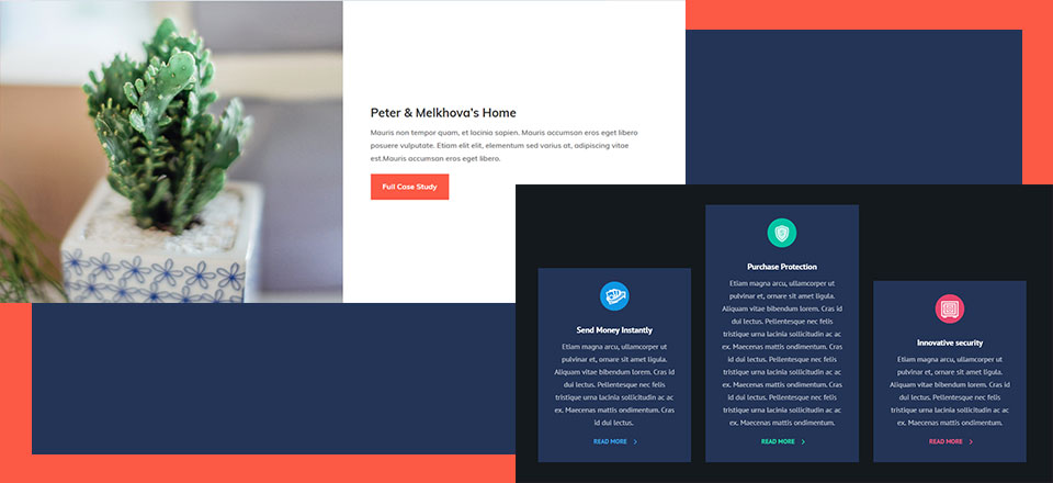
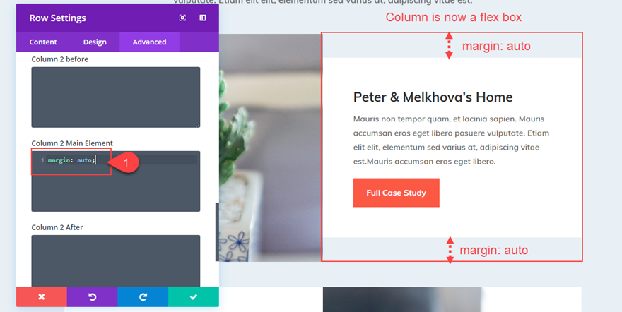
For example, if you add “margin: auto” to any column in a row, the content of that column (whether it be one or more modules) will become vertically centered.
Also, if you add “align-items:center;” to your row, all of your columns (and their content) will be vertically centered.
Of course, there are many more uses for the flex property in web design along with more advanced CSS that you can apply to your theme. But for this tutorial, I wanted to keep things simple.
Is This Really Necessary?
Technically, no. You can vertically align your content/modules within a column using custom spacing (padding and margin). For example, you can use Divi’s spacing options to give a column equal top and bottom padding to center the module(s) vertically within the column. Or, you can add only top padding to a column to make the content bottom aligned. However, you may have to adjust the spacing when updating your page with more content. Plus, it may be difficult to keep this alignment on different browser widths.
So, if you are looking for a solution to vertically aligning content without having to think about custom spacing, I think you will find this useful.
Let’s get started!
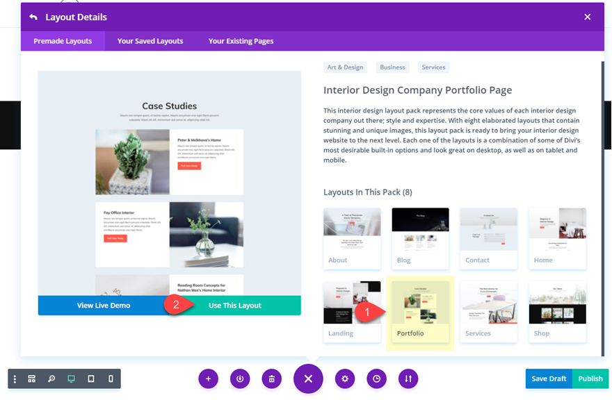
Load the Premade Layout to Your Page
To kick things off, I’m going to use the Interior Design Company Portfolio Page Layout. To get this layout on your page, create a new page. Then give your page a title. Click “Use Divi Builder” and then “Use Visual Builder”. Then select the option “Choose a Premade Layout”. Then select the Interior Design Company Layout Pack from the Load From Library popup. Finally, select the Portfolio page from the list of layouts and click “Use this Layout”.
Once the layout has loaded to your page, you are ready to go.
Method 1: How to Vertically Align Content using Flex and Auto Margin
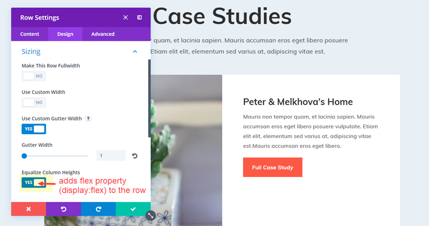
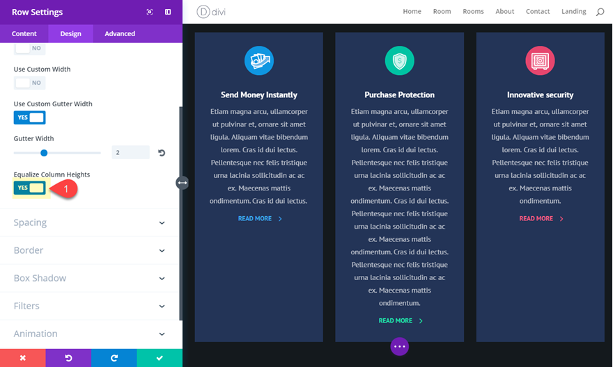
Open the row settings of the second row on the page (the one directly under the row with the page title). Under the design settings toggle open the Sizing option group and notice that “Equalize Column Heights” is already active. This means that the row now has the flex property (“display: flex;”) added to it.
Now go to the Advanced tab settings for the same row and add the following css snippet under the Column 2 Main Element input box.
01
margin: auto;
Now the second column content has shifted to become vertically centered.
Making the Content Bottom Aligned
If you want to make your content bottom aligned so that all modules will stack on the bottom of your column, you can adjust the margin value as follows:
01
margin: auto auto 0;
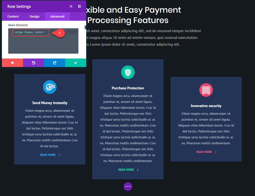
Aligning Content Vertically for All Columns in Your Row
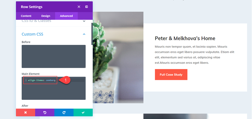
Instead of adding “margin:auto” to each column individually, You can also vertically center the content of all columns in your row by adding the following snippet to the main element of your Row settings.
01
align-items: center;
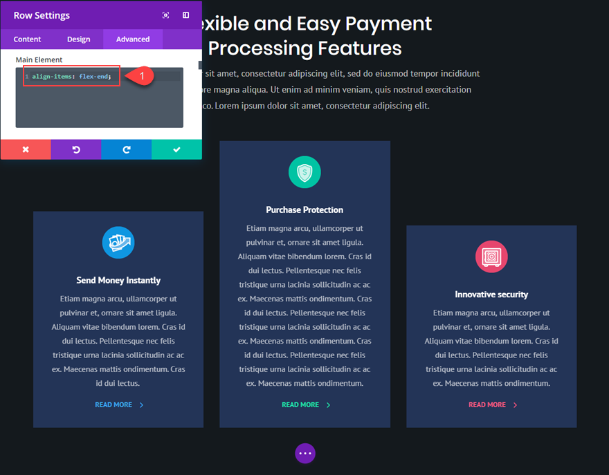
Or if you want all the content of your columns to be bottom aligned, you can add this snippet:
01
align-items: flex-end;
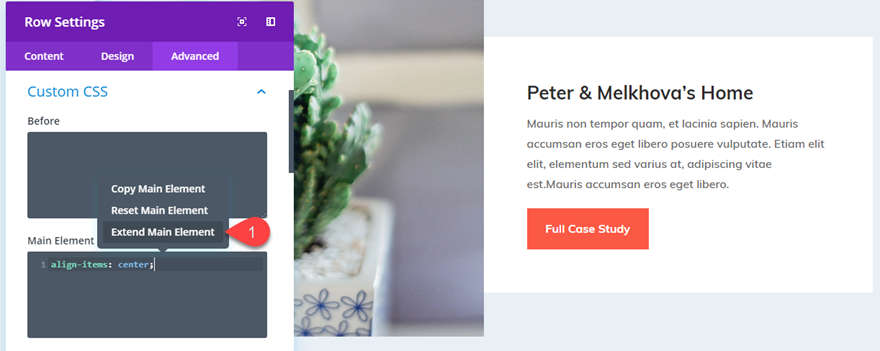
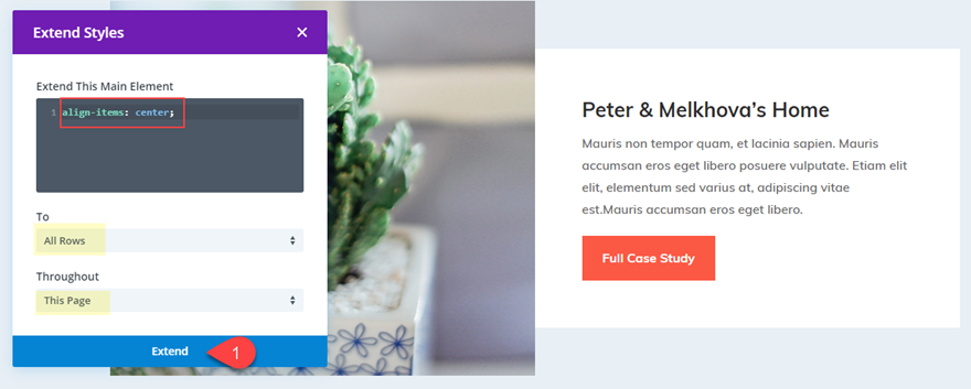
And, don’t forget that you could take advantage of Divi’s Extend Styles feature by right clicking on the main element with your css snippet and clicking “Extend Main Element”.
Then extend that main element css to all rows throughout the page (or section) to vertically center all the content of every column on the page.
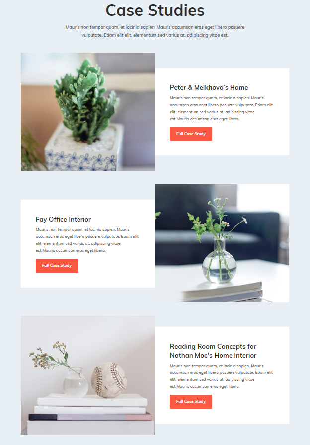
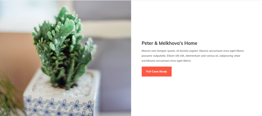
Now everything is vertically centered.
But, you may have noticed the white column background color no longer spans the full height of the row. This is because we added “margin: auto” to the column. To fix this, you could change the row background color to white and get rid of the row padding. But instead, I’m going to show you a way for you to center the content of your column without changing the margin.
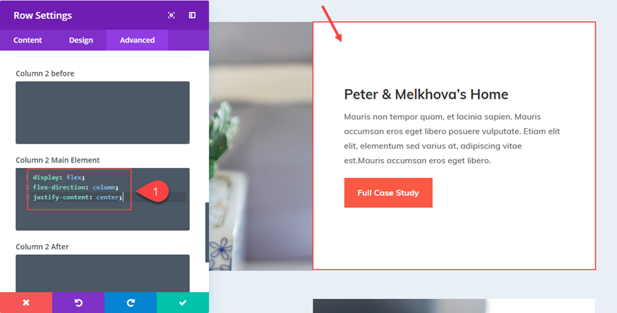
Method 2: Vertically Aligning Content using Column Flex Direction
In the first method, we took advantage of the flex property being added to the row. This made each of our columns a “flex box” that can be vertically aligned simply by adjusting the margin.
But there is also a way for use to flex-direction to align the content of our column without losing the “Equalize Column Height” effect that keeps our columns (and column backgrounds) the same size. To do this we are simple going to add a few lines of CSS to our column so that all the modules within the column will be stacked vertically and then centered.
Let’s go back to our row in the previous example. Open up the Row Settings and take out any custom css you may have in there by right clicking on Custom CSS and clicking “Reset Custom CSS Styles”
Then add the following CSS under Column 2 Main Element:
01
02
03
display: flex;
flex-direction: column;
justify-content: center;
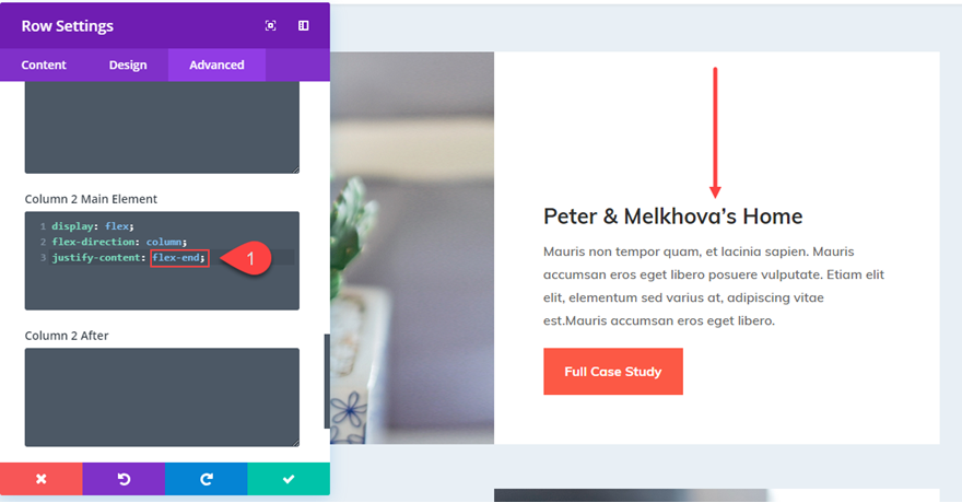
Or if I wanted to bottom align the content, simply change “justify-content: center” to “justify-content: flex-end”.
What is great about this setup is that if I have my content vertically centered and I make the row full width, the content stays centered.
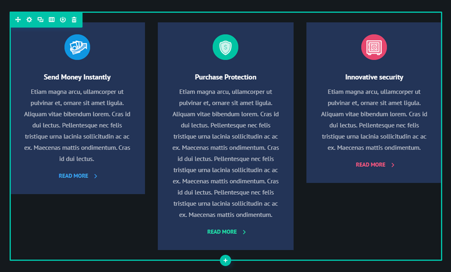
Making Blurbs with Various Amounts of Text Vertically Aligned
Making your column content vertically centered can also come in handy for blurbs. As you know, not every blurb will have the exact amount of text used to describe the feature or service. Making these blurbs vertically centered can create a nice design for your layout.
For this example, I’m going to vertically align the blurbs on the Digital Payments Home Page Layout.
I’m going to first add some differing amounts of body text to the blurbs to give a more realistic representation of what a site might look like.
Now, I need to go to the row settings and “Equalize Column Heights”.
Now I can add my CSS snippets to align my content and change the design.
Under the Advanced tab of your Row Settings, we can vertically center the content of our columns by adding the following under Main Element:
01
align-items: center;
Or change it to the following to make them bottom aligned.
01
align-items: flex-end;
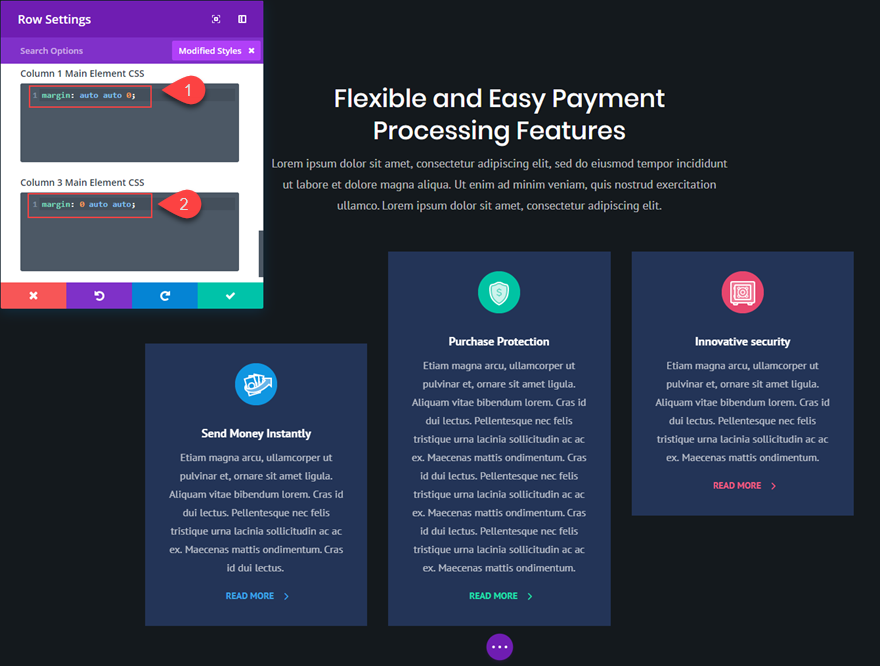
Or you can reset your custom css styles and add the following custom margins to make the first column bottom aligned and the third column top aligned.
Column 1 Main Element CSS:
01
margin: auto auto 0;
Column 3 Main Element CSS:
01
margin: 0 auto auto;
What About One Column Layouts?
Technically, you don’t need a css snippet or flex to get your one column content vertically centered. All you need to do is make sure you have equal spacing above and below your content (or modules). Most of the time, people need vertical centered content on layouts with multiple columns because they want the adjacent content to line up perfectly.
Lots of Applications
There are a lot of useful applications vertically aligning your content in Divi. This would come in handy for headers with a two column layout with the heading text in one column and you want to make sure a CTA (button) in the other column is vertically centered. It would also be helpful for vertically centering logos in a six column layout (especially if the logos have slightly different dimensions).
Final Thoughts
Even though this method does rely on a few small snippets of custom CSS, I believe the application can be extremely useful for those looking for a quick fix to a sometimes cumbersome process. I would love to hear of other examples where this might come in handy.